In the realm of high perfumery, Jean Paul Gaultier’s Fleur du Mâle (Flowers for Men) remains a landmark of subversion. It took the hyper-masculine sailor archetype and dipped it into a vat of pristine, milk-white porcelain, accompanying it with a scent of orange blossom that defied the “macho” status quo. It was an exploration of purity, light, and the floral sensitivity of man.
But what happens when the sun sets on that white garden? What happens when the light is not just dimmed, but entirely consumed?
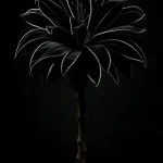
Black Tulip is a creative exploration into the antithesis of that purity. It is the shadow to Gaultier’s light, a concept-driven fragrance that replaces the white porcelain with the depth of the abyss and the legendary, elusive mystery of the Dutch Black Tulip.
Disclaimer: The Creative Boundary
This project is not affiliated in any way with the Gaultier brand. This is a completely personal creative concept designed to explore the visual and olfactory boundaries of the iconic Le Male silhouette.
The Design: The Architecture of Absence
The visual identity of Black Tulip hinges on the total rejection of light. While the original Fleur du Mâle used a white metal tin and a white glass torso to symbolize cleanliness and floral softness, Black Tulip utilizes “Vantablack” levels of saturation.
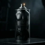
The Bottle: The iconic male torso is stripped of its stripes and its skin. It is rendered in a dual-texture finish: a matte, rubberized black body with high-gloss “liquid obsidian” accents on the musculature. To touch it is to feel something cold, tectonic, and undeniably modern. There are no labels, no gold chains, no distractions. The bottle is a silhouette standing in the dark.
The Packaging: The legendary tin can—the “conserves” box—is reimagined in brushed charcoal metal. The embossed lettering is not printed in ink but is instead stamped into the metal, visible only when the light hits it at a specific angle.
“Black is the most misunderstood of all colors because it is the only one that can contain everything and nothing simultaneously. It is the silence before the symphony.” — Lead Concept Designer
The Olfactory Narrative: The Impossible Bloom
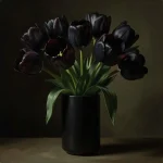
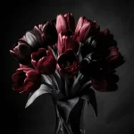
The Dutch “Black Tulip” of legend—the Queen of the Night—was never truly black; it was a deep, bruised purple that flirted with the darkness. To translate this into a scent, Black Tulip moves away from the airy orange blossoms of its predecessor and dives into the soil and the night.
The fragrance is built on a “Metallurgical Floral” structure:
- Top Notes: Black Pepper, Saffron, and a cold, metallic “Tin Can” accord that pays homage to the packaging.
- Heart Notes: Dark Orchid, Night-Blooming Jasmine, and a synthetic “Ink” note that mimics the smell of a fresh printing press.
- Base Notes: Black Amber, Vetiver roots (still covered in earth), and a heavy, animalic leather.
While Fleur du Mâle was a scent for the daytime, for the open air and the spring, Black Tulip is a nocturnal predator. It is the scent of a man who thrives in the shadows of the city, a man who finds beauty in the industrial and the obscure.
Digital Marketing: The “Darkness Revealed” Campaign
In a digital landscape crowded with bright, high-saturation imagery, the marketing for Black Tulip would rely on The Aesthetic of the Void.
1. The Teaser Phase: “The Vanishing”
The campaign begins with social media blackouts. For 24 hours, the brand’s digital presence disappears, replaced by a single, 15-second looping video of black ink clouding into clear water until the screen is total darkness. No text. No logo. Just a heartbeat rhythm.
2. The VR Experience: “The Midnight Garden”
Using augmented reality (AR) filters, users can “scan” any black surface in their environment. Through their phone screen, a 3D black tulip will bloom out of the darkness, its petals unfolding to reveal the silhouette of the bottle. This bridges the gap between the physical and digital, making the “void” interactive.
3. The Influencer Narrative
Rather than traditional “lifestyle” influencers, the campaign partners with digital architects, dark-wear fashion designers, and underground techno producers.
“We aren’t selling a scent; we are selling the mystery of what happens when you stop trying to be seen and start trying to be felt.” — Digital Strategy Lead
4. The “Pure Black” Photography
The hero shots of the campaign are captured using ultra-low-key lighting. The bottle is never fully lit; instead, its shape is defined by the way it reflects its surroundings—a sliver of light on a shoulder, a glint on the spray nozzle. It challenges the consumer to look closer, to squint, to engage.
Conclusion: The Power of the Counter-Concept
Black Tulip serves as a testament to the power of the “Mirror Concept.” By taking the DNA of a beloved classic—the JPG male torso—and inverting its color, its texture, and its floral inspiration, we create a dialogue between the past and a potential future.
Where the white bottle represented the “Flowers for Men” in their most innocent form, the black bottle represents the root, the earth, and the hidden desires that only bloom under the cover of night. It is a celebration of the legendary Dutch tulip—a flower so rare and so dark that it was once worth more than gold.
In a world of constant noise, Black Tulip is the luxury of silence.